Monday, May 9, 2011

Tony Cragg

Tony Cragg uses recycled materials to create his sculptures. For example, one takes the shape of a British flag, but up close there are colorful and individual shapes that are made from things like toothbrushes and metal washers, all painted. Other sculptures include reclaimed wood furniture.


'Stack', 1975

Look at all that trash! This cube is made out of completely recycled materials. I don’t know if this is held together with some type of trash glue, or if it is all held by stacking. The part that amazes me most is the circular barrel in the bottom right; it defies the cube aspect of the piece.


I couldn’t find a title for this piece, but my favorite part about this is the colors that he has used in making this piece. Each individual piece has its own individual colors that I am sure were different before they were painted to have continuity in the piece. The way it goes from violet to blue and contrasts with the orange and yellows is a great way to show this artists pallet. An artist’s pallet can consist of not only paint, but any kind of material. And the transformation that Cragg does proves that concept perfectly.


I do believe he painted each piece individually in this sculpture. All of these recycled materials have made this rainbow. There is no hidden pictures within but I think the hidden picture of needing to recycle and be green is the idea that is shown through this piece that he has created.


This is the flag that I was talking about in the introduction! This British flag is important to him because he is from Liverpool. He has made extremely precise lines with the random objects that he has chosen. I, however, do not like the spaces that are in between each section; I want it to feel more complete instead of all of that white space within those shapes.


Buttons! Why not create an art piece out of all of the buttons you have found. I think this is brilliant and beautiful. Using recycled pieces is cheap, and green; Cragg’s work really inspires me to use something else for my art work.

John Chamberlain

John Chamberlin is a sculpture artist who makes sculptures out of old cars that he has broken down.

M. Junior Love 1962


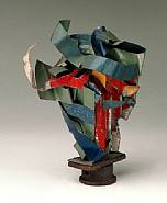
This is my favorite piece by Chamberlain. I think it is because of the colors and the animal like nature of the top piece. I feel like it is an ancient bird that has been placed on a pedistol for museum viewing. The bends and rusting and angles of each form is beautiful and organic in nature. The 'z-like' form keeps the audience's eye moving from the top to bottom.

Latin Disco 1975
The transformation that has happened for these cars is incredible. The bright yellow is a major focus point in this piece. It reminds me of a bag that is holding the other materials on the top. I don't really understand what Latin Disco is, but I really enjoy, again, the formal qualities that Chamberlain has created here in this sculpture.

Hudson

The formal qualities of the bends and rusting and scratches and linear pieces are very pleasing to the eye. The dirty quality of it makes it feel as if it has been pulled out of the ground and is a new treasure that has been found. It has a history, not only in it's looks but what it has been made out of. Cars have history, the people, the places, etc. And I think this beautiful sculpture shows this.

Mark Bradford is an artist who transforms materials that he has taken from the streets; he turns these into wall-sized collages and installations that are in response to networks in a city such as underground economies, migrant communities, and popular appropriation of abandoned public space. His paintings are mostly abstract and often have layers and layers of paper collages that are map-like and also refer to the organization of streets, buildings, crowds, and more. For his collages, he uses things such as paper, cardboard, rope, string, and more; this can also define him as a sculptor.

Scorched Earth, 2006

I really enjoy when an artist uses a title to inform their work while still allowing the audience to make their own assumptions and understandings of what the artist is trying to say. Based on the title, one can tell that it is a picture of despair and ruin. Scorched is not a word to use when describing a good activity; it is used to describe complete demolition. And I think these city like forms are important in showing the world ending because this over colonization is what is making bad things in this world happen. Formally, I think this piece is really interesting because of the directionality and color of these geometric squares. The white and almost ‘peaceful’ squares are horizontal and the scorched parts are in a diagonal and falling like position. There are also primary colors within the scorched ruins as well.


Red Painting, 2009

This piece, again, I love because of the title. Taking collaged pieces and calling it a painting defies what a painting really is! It reminds me of an artist who put water in a cup on a shelf and called it an oak tree! And, the foremost color in this piece is not all red, it is mostly white, which I also think is quite ironic. But I guess that is part of being a professional artist and being able to defy what is common.


Untitled, 2009

Here I go again with titles: I do not really understand why Bradford did not title this ‘Freedom without love.’ I really wish I could as him. These colors mimic those colors in the red painting piece that he did, and again, it is in a collage format. This piece relies solely on the text itself; freedom without love means…what? I think it defies what most people think; love is supposed to give you everything, and freedom should come along with that. But maybe he is focusing on the pain that is involved in love.

John Baldessari

John Baldessari does photomontage, painting, uses language, and juxtaposes images that illuminate, confound, and challege original meanings. He draws his viewer's attnetions to minor details, absences, and spaces between things. He does things by blocking out important information with colorful dots and obscuring geometric shapes.


Beethoven's Trumpet (With Ear), 2007
Resin, fiberglass, bronze, aluminum and electronics

This piece is extremely interesting to me. I feel that making the ear the same color as the background, it depreciates the ear and makes it less important to me. The large trumpet is what is important in this scenario. I think he is trying to say that listening is much more important than just hearing something; the fact that the viewer can interact with it in such a way that they can stick their entire self in there makes them have a whole new experience with the ear. This experience is what becomes the art.


Hitch-hiker (Splattered Blue) 1995
Colour photograph, acrylic, maquette

This piece shows the way in which he uses bright geometric shapes in order to hide part of his paintings. The way he does this makes it so the viewer is unable to get a bit of information that is behind this pieces. It is quite frustrating actually; the bright nature of them brings your eye right to them and that usually means that there is something important there, but yet we can’t see it. In this sense, maybe he is trying to protect the Hitch-hiker from further rejection.


The Pencil Story 1972 - 1973
Colour photographs, with coloured pencil, mounted on board

An epiphany, words, they can be pieces of art. That is how Yoko Ono works! The way he has labeled, discussed, and documented this action becomes the art in itself. This is not just photography that makes the piece, it is the larger issue of removing the artist’s hand from consciously thinking about photography and the subject matter, to something that leads to work from the mind. His quote, “I’m not sure, but I think that this has something to do with art” is quite interesting; I think that he has made a discovery that anything can be art, and he is growing and contemplating the artist in himself.

Jennifer Allora and Guillermo Calzadilla

Jennifer Allora and Guillermo Calzadilla  have been collaborating artists since 1995. They experiment with many ideas; many of those ideas consist of nationality, borders, and democracy in our consumerist society. They do sculpture, photography, performance, sound, and video, and sometimes combine them. The enjoy exploring the “complex associations between an object and its meaning” with historical, cultural, and political metaphors that are often made out of basic materials for a medium.


“Hope Hippo”
2005. Mud, whistle, daily newspaper, and live person.

Here they have made a giant hippo; in this installation piece, they invite people and volunteers to read the daily newspaper while sitting on top of the hippo. This piece has got me stumped, and I am willing to admit that. I do not know what a hippo has to do with daily newspaper or hope.


“Returning a Sound”
2004. Single channel video with sound, 5 minutes 42 seconds.

This video was made in Vieques, Puerto Rico; this island has been used for the past 60 years by the U.S. Military and NATO forces to practice military bombing exercises. The background information is important when understanding the purpose of this piece; there has been local civil disobedience movements that are trying to stop the bombing and are wishing for the removal of the U.S. Military forces. This video is addressing the landscape of this place and also it’s sound. Sound is important to the residents of this island because they are “marked by the memories of the sonic violence of the bombing.” The man who rides this around the island is a civil disobedient and an activist; there is a trumpet that has been welded to the muffler of this motorcycle. The noise that comes from it has been transformed, and it now sounds like a call to attention. “it becomes a counter-instrument whose emissions follow not from a preconceived score, but from the jolts of the road and the discontinuous acceleration of the bike’s engine as [the man] acoustically reterritorialzes areas of the island formerly exposed to ear-splitting detonations.”

This much meaning put into an almost six minute video is important when knowing the story behind it. The artists were very specific in hitting home to a political problem in these peoples’ lives.


Land Mark #1, 2001

(Foot Prints); digital C-print

19 1/5 x 23 7/9 inches


I think this title is really important in informing this piece. Footprints symbolize people, and I feel this is saying that wherever people step, they are making a mark in this world. I can’t quite see the detail all that well in these footprints, but one can tell that there are pictures, words, people, etc in each print that the artists have probably carved into the bottom of a shoe. Landmarks and successes in the world are made by people, and that is what this piece represents.


Josh Goldstein

Josh Goldstein’s Art is inspired by a fascination with the density, decay, and diversity of New York City. Things such as street signs, chinese take-out, menus, graffiti tags, and other urban culture influence his work.  He uses salvaged plywood. He says, “It is my aim to re-contextualize the banalities of city life through my salvaged plywood constructions.” The subject matter in which he uses creates two worlds that do not mix; a salvage and broken plywood idea clashes yet is transformed to the urban culture of New York. Recently, Target commissioned him to design three billboards for Times Square; these will be a total of 6000 square feet.


Water Tank #1, 2010

Photographic collage on salvaged plywood,

15"x15"

This piece screams ‘America’. The red white and blue are iconic symbols of America, and many urban cultures fall into this nationalistic scheme. The water tank falls into the same idea as the salvaged plywood; it is not just any water tank. It looks like an old farm water tank that would serve the purpose of providing water for about three people in a ten mile radius; it completely defies New York City and the fact that it is in a 9X2 mile radius with millions of people, this water tank would not suffice. And I think that that is the point that Goldstein is trying to make; there is a difference between urban life and suburban life that he is capturing here.


Egg Foo Nosh, 2010

photographic collage on assorted salvaged plywood  50"x78"

Well I don’t really understand where he got the ‘Egg Foo’ part of this title but I did find the nosh words on the right hand side! I really enjoy the colors that he has experimented with here; it defies the brightness and loudness that comes with New York City. I think here he has focused on the Chinese Food or just fast food in general. The text he has used such as chow mein, fried rice, strictly kosher, hot dog king, checks cashed, chicken fish and steak, sandwiches, coffee, danger hollow sidewalk, roast pork, etc, plays into the urban food and urban city feel. The geometric squares in this layout fit like a puzzle and keep your eye moving throughout the entire piece, and the color also helps that: there is yellow, orange yellow, orange, red orange, red, red violet, violet, and all the shades in between for every single color. It is beautiful.


Chuleta Sunrise, 2009

Photographic collage on salvaged plywood

45"x10"

The title in this one leads one to the meaning behind it. This sunrise is a mixing pot of cultures that are involved in urban culture. The graphic sun is really interesting in this piece. There are no complete words in this piece except for the word Chuleta which he made part of the title. The staggering of the geometric patterns are really interesting in this ‘sunrise’ piece. The bright primary colors are something that is not seen in a sunrise, and I think it redefines what a sunrise is in terms of an urban setting.

Sunday, May 8, 2011

Andrea Zittel

Andrea Zittel is an artist who works with sculpture and installation. She transforms things that are necessary for life whether it is eating, sleeping, cleaning, being social, etc. She says, “People say my work is all about control, but it’s not really. I am always looking for the gray area between freedom—which can sometimes feel too open-ended and vast—and security—whichi may easy turn into confinement.” Zittel even likes to ‘reinvent’ her own life by changing up her domestic and social relationships. It has been said that Zittel is very interested in revealing the human need for order instead of making a single unifying design principle or style as an artist.


Untitled Island

Zittel made a 44-ton floating island off the coast of Denmark; this piece is her objective to attain a sense of freedom through this giant structure. This piece goes along with her ideas of contrasting domestic and social culture. It completely contrasts the extremes of a creative escape with the isolation that occurs when a person is removed from society. (Kinda like Hawaii after a couple weeks of vacation ;) ) In her island she has removed, figuratively, the things that people take for granted every single day. It’s brilliant and beautiful.


A-Z Escape Vehicle, 1996

Steel, wood, carpet, plastic sink, glass, mirror, stovetop, and household objects

Here Zitell is again playing with something that is everyday life. Why is it that we all want to create that separate life, that world where you can escape and have your own little life alien to the rest of humanity? We’ve all set up a blanket and dinner chair fort in the middle of the living room and some point in our life; Zitell has kept this house like alienation alive. These Escape vehicles are something that lets the human being escape into their own secret world with everything that they need. I personally would be quite Closterphobic…


Living Unit Customized for Eileen and Peter Norton, 1994

Steel, wood, paint, mattress, glass, mirror, lighting fixture, upholstery

93.3 x 213.4 x 96.5cm


This is another instance in which Zittel is taking everyday instances and placing them into one unit in which a human being relies on only what is necessary. Formally, the geometric patterns act somewhat like a puzzle here; seeing in what way the cubes will fit best for the customization and for functionality is a project in itself, and from that an art work emanates.


This piece reminds me of her untitled island piece. It is made entirely out of carpet. She has taken something that is jagged and unrelaxing like these rock like formations and turned them into a comfortable place to relax and live. The transformations she creates with everyday activities is something that is to marvel.