Friday, February 11, 2011

Cheeming Boey

Styrofoam cups are something you buy in bulk for your party to fill with sodas for all of your friends. But Cheeming Boey, an animator and game designer, has taken Styrofoam cups to a whole new level. He uses a regular sharpie to draw on regular Styrofoam cups, and what comes from that is something interesting and beautiful; the Styrofoam cup is no longer a plain discardable object. He is also quite humorous at times.  And just so my viewer isn’t confused, some of the pictures I show may look like two cups but it is only one held up to a mirror to help show the detail on the other side of the cup.
red
“When I was a kid, I had a balloon that flew out to the streets. I chased it and was almost hit by a car. If I got hit by a car, no one would be drawing on foam cups” -Boey

I personally feel that the quote above by Boey is a big part of this piece. Right away you can see that these little creates are doing everything that they can in order to reach this red balloon, and when he relates this image to himself, it becomes all the more touching. Plus, he is right! No one would be drawing on Styrofoam cups! Boey has not created much difference in the quality and thickness of line in this drawing, but I think it works here for the simplicity of the message it sends. It almost one feel sad when looking at how close they are to getting that red balloon that they obviously desire and not being able to reach it. I think the level of danger, like almost getting hit by the car, is shown too; one of the little creates is falling and a few are helping it. Sometimes when we desire something so much we often look over the elements of danger we are putting ourselves in.

khünbish

"khünbish" means ‘not human’
left to right : "naranbaatar", "katsuro", "sha baihu" amd "deathcoil".
drawn over a 3 month period


This one clearly has some under laying Asian mythologies that the viewer may not understand unless they have studied that subject. The use of like here seems to vary differently in quality than some of his other pieces. This is also clearly using line to show a 3-D/curving nature of the objects. I chose to show this one because I think it is incredible that he took about 3 months to create this piece as a whole four cups. The attention to detail is incredible, and I liked how he tied them together with that curling object/line that is repetitive on the cups. The simplicity of setting them on the pieces of cork is a great way to tie them together and bring each cup into the entirety of the four cups together.

fedor emelianenko

“Achieving likeness was tough, because unlike what I was taught in art school, where we focused on nailing down big shapes before working on finer details, I had to work in reverse, because I am drawing directly with a sharpie. So I started with his left eye, and I slowly worked outwards. The curved surface made his head look longer than it is wide, but it really isn't when seen in person. I wanted to give up after working on just the face after a whole weekend. Then just when I was about to, a guy at the cafe walked by and said, "Whoa! It’s Fedor!" I guess I wasn't doing too bad a job, so I kept on going.” -Boey


I chose this piece because of what Cheeming Boey said about his trials and triumphs when going through the process of creating this piece. It makes me realize that even some of the best people and artists have to go through a hard time and figuring out your materials just like everyone else. It makes them seem more human to me. He did this as a tribute to the martial arts fighter Fedor. He uses a stippling technique on this cup compared to others which mostly use line. I think this was a great challenge for him, and I wanted to show that challenging yourself can sometimes be a great victory.

buenos vientos

“I used to think that the smoke that came out of a train's chimney and a ship's funnel became clouds. My imagination was much more fantastic back then, before science ruined it.”


This is another piece in which I feel that his personal story/quote makes the piece. And it also just made me giggle, and I think that any piece of art that makes you feel something should be shared. Here he uses a good use of different qualities of line, and when you look closely at the dots, they are so precise that they make their own line as well. Although there is a point where science and art can emerge, it is often thought they clearly butt heads, and I think it is great that Boey is confronting this and making it personal to himself again.


second best


This one has great use of the sharpie and the sharp contrasts between black and white are really apparent. There is also a good attention to detail were he has drawn the city, the bridge, and I love the sweet simplicity of the lamps on the bridge. This one not only made me laugh, but also made me feel sad! This little boy (who may have finally gotten that red balloon!) is being stood up by this giant balloon. In this world, there is always going to be something better. And I think that is what Boey was trying to say.

Hope you enjoyed the transformation of styrofoam cups as much as I did!

Monday, February 7, 2011

Fred Eerdekens

Fred Eerdekens
When you were a child, do you remember having just your night light on and making funny shadows on your bedroom wall? Sometimes your fingers looked nothing like what came out on the wall! Well Fred Eederkens, a contemporary artist, works with new materials to create shadows; these shadows are special-it is almost as if he creates words out of nothing, he creates words out of holes and twisted material. I am happy to have come across this artist so I can have a chance to show you his great and unexpected art work. The mysterious objects are shown through his use of light; the light is clearly something he has gotten to know inside and out, and he is showing us what is hidden.


God-Ego, 1990
wood, 2 light projectors
18 X 18 X 10 cm

When you look at this strange linear piece of wood, you never imagine the words that it would spell. How Eederkens is able to do this I will never know, and I do not think I want to know; it would take away the wonder of it all if I knew how he was able to think about and construct these pieces. Some of the words that he creates from light emitting a shadow do not involve anything meaningful such as his Ooo, Ahh piece, or his mmmhhmm piece; this, however, obviously means something, and it could mean something different to each individual. To me, he might be saying that God has an ego! Sometimes his words are humorous and I think that here that humor might apply. In any case, it is clear that a lot of thought and work went into creating this piece.


'a very short story-with a lot of fiction in themiddle-and somthing real in the end', 2005
Copper Wire
94.5" X 6.25" X 3.875"

I literally laughed when I was able to read what the shadow says. I don’t know exactly why it struck my ‘funny bone’, but I think his humor and ability to manipulate and understand the words themselves is really pleasing. The copper contrasted with the light blue background works really well in this installation. The shadow even comes out dark blue which contrasts well with the light blue behind it. I think these words might reflect and say a lot about who Eerdekens is as a person, and I wish I could ask him personally where his choice of words came from here. The curvilinear quality of the object that is creating these shadows is interesting itself! If you can pay attention and look at just those, it keeps your eye moving along them, and it is even more amazing that they are able to create words.
life itself is nto enough, 1999
clothing, glass, steel, light projectors
700 X 120 X 90 cm
This is probably one of my most favorite shadows that he has done. I am not sure if the materials serve any purpose to the meaning behind the words, but the words themselves are pretty impactful. Life should be everything right? So what more is he saying that we need? This one perplexes me, but it seems most questioning, and I really enjoy that.

Fred Eerdekens is doing something different in this art world today. Yoko Ono, the blog I did previously, also works with words. It is a cool thing that words can become art in this day. I really like that Eerdekens objects that make the shadows are art pieces in themselves, and it is almost as if the object and the words and shadows and negative light spaces are one piece in itself.
                     

Yoko Ono

When you hear the name Yoko Ono, one may think ‘John Lennon’s wife.’ But she is much more than just that; she is an incredible artist and has a side to show that many people may not know. She is an artist who thinks outside of the box and takes simple or extravagant ideas and turns them into advocating and thought provoking pieces of art. Many of her pieces involve the viewers’ interaction; this makes her work personal, energetic, persuading, informational, and personal to the individual participating. She reenacts a lot of her artworks so it is often difficult to find dates on when her art was done.
                                   
 Painting to Hammer a Nail
When Yoko Ono did Painting to Hammer a Nail, it was an invitation to viewers to pick up a hammer and hammer a nail into the wood (yes, this piece of wood was blank when it started). It was a part of a series she did that was called Instruction Paintings. I feel that this piece invites people to discover themselves, by pushing a nail into this white thing is part of a self-discovery. This piece could not have been done time and time again without people following Yoko Ono’s instructions; it was a group collaboration that created a thing of destruction and beauty.


       Cut Piece

In this piece that Yoko Ono did, she invited the audience to use scissors to literally cut away the clothing she was wearing. This is part of her activism that she portrays in many of her art works. This piece of art was a performance. Every time that Yoko Ono reenacted this performance, it was unique. It obviously would depend on the size of the audience and how aggressive they were in cutting the pieces of clothing from her body. This was a piece of art to represent the role of women in society. She said in video I watched that she would purposely wear expensive and nice outfits to represent this, and that she would literally lose a nice piece of her clothing each time she did this performance. Here the public also becomes part of the art that is made just as in many of her pieces.

           Hide-And-Seek Piece                                                                                       Yes

Have you ever had random thoughts that you just write down? Why not make those thoughts, those imagination pieces that make your brain ‘you’, a piece of art. Yoko Ono does this a lot with her instructional pieces of art and with interaction pieces. Hide-And-Seek is powerful and makes people think; it is an odd thing to say, but she has written down her imagination. Yes was a piece where she placed a ladder underneath a flat surface that was attached to the ceiling (or in some installation pieces it was on the actual ceiling of the building), and she hung a magnifying glass nearby: this invited the viewer to take the magnifying glass and see what was written on a small piece of paper. The word ‘Yes.’ A lot of work that Yoko Ono did, along with John Lennon, were pieces of peace activism; I think these and along with many others show that side of her and her husband.

The Wish Tree, which has also been done time and time again, is another instructional piece in which Yoko Ono tells her viewers to put wishes onto the ‘wish tree’. This is, again, advocating ideas and reaching into personal lives. It requires many people and viewers to make this piece of art what it is. There is something special about having your wish among others connected to this wishing tree. Yoko Ono’s instructions tell you to ask your friend to attach their wish to the tree, and it is almost clear that you must obey, even though it is your choice not to because she is not forcing you to do any of her instructions. After taking part in such a self-discovering act, I would assume I would feel excited to tell my friends to participate.

Yoko Ono has a unique but incredible way of portraying her ideas and art pieces. One of my favorite things about her is that she depends on her viewers/public/audience in order to create her pieces. It must be nerve racking for her to expose a blank canvas and give people quiet instructions; what if she gets a group that does not want to participate? With her way of doing art, she takes that risk: it is up to the public to create their own experience. I would love to make it a goal to go see her work in person and take part in her art pieces and learn more about myself by doing them.


Sunday, February 6, 2011

Extra Credit: Megan Sterling

Megan Sterling recently had her opening of her exhibition 'The Space Between' in the Visual Arts Center on the Boise State University campus. I feel incredibly lucky to be exposed to art through my university; being able to go see Sterling’s pieces was a great experience. The medium she chose to use was charcoal. She really inspired me to get better at working with charcoal, because her pieces were so detailed and moving. The charcoal, black, was always contrasted with the white of the museum paper; it was a stark and interesting feeling.


The Space Between, 2007
Charcoal on Museum Board (Cut Out/ Installation)
30"X120"

The Space Between was my favorite and the one that affected my emotions the most when I was in her exhibition. There is invisible space in between the hands yet you can tell they are pushing against something hard. I felt as if I wanted to crawl in between those giant hands and just be held by them and be that ‘space between’. There is exceptional value in this drawing that is made with the charcoal. The value created makes the hands so extremely detailed. As you can see by the picture (which is not me by the way), I felt extremely small standing next to those giant arms!

Within, 2007
Charcoal on Museum Board (Cut Out/ Installation)
80"X51"


This piece also made me feel extremely small. I felt like it was almost a frame that told me to stand in it and be its picture. So I did! I stood in between the arms, and it increased my feeling of being small, but it made me feel like I was literally within the arms. Again, the extraordinary attention to the range of value makes the arms and hands pop out and feel so detailed as if they are truly giant hands, not a flat museum board.

Friction, 2007
Charcoal on Museum Board (Cutout/ Installation)
38"X50"

This was another really moving piece by Sterling while experiencing her exhibition. To me it is not just two hands creating friction between them, it makes me question what tension there is or friction there is in these hands’ life that are making them so rigid. You can tell they are rigid and stressed, again, because of the amazing value that Sterling does with her black charcoal on the white board.

Another piece, that I was unable to get a picture of, is called City Scape. This piece made me feel the most small, because the title made you imagine the fingers to be as tall as the buildings of the New York sky line, and imagining fingers and a hand that giant certainly makes you feel small.

Another piece that really made me think was called The Space Between III. It was like the first picture posted here, but the bottom was not a hand, it was an ear! The ear was turned sideways as if the hand was pushing something into the ear. It made me feel like whatever the thing was that the hand was pushing in, it really wanted the ear to know it, to hear it.

Another piece that was quite personal for me was called Waiting for You. It was a line drawing of a man and a woman. The man was reaching for the woman. The woman clearly had a longing face, and the interesting thing was there was another linear face that was part of the woman that was looking down in sadness. At first I couldn’t understand why the artist had put this in the exhibition because it had no value and did not seem to relate at all to the rest of the exhibition; but I felt the distance between the two people; I was once apart from the man I love for a very long time and it brought me back to that place. There is extreme space in between, but also a connection, which is what I felt and saw in Waiting for You.

I loved the experience I had going to Megan Sterling’s exhibition right here on the Boise State campus. I recommend to anyone to go out and see her work in person; the detail and subject matter is much more inspirational and touching when you see her work in person.

Tricia Cline

Tricia Cline
Tricia Cline is a self-taught artist. She works mostly with porcelain in order to create incredible sculptures. She has been making these sculptures since 1984. She mostly works with the subject matter of women and animals. I think she is an amazing artist because she has had no formal training or education and creates very moving pieces that make her viewer have to stop and think about her messages.

Cline did the sculpture Hazelra in 2008. This is from her exhibit called Animals. Her choice for this sculpture was using porcelain and oil paint to create the color on top of the porcelain. This piece is about one foot tall, ten inches long, and seven inches wide; it is pretty close, maybe a little bit smaller, than an actual jack rabbit. The color, however, is the most exciting thing about this piece. The burnt orange immediately jumps out at you. The sculpture is extremely detailed. I think that if you were there, seeing this in real life instead of in a picture, it would seem as if there was a real animal sitting atop of an ornamental bench: it is almost as if she sculpted each and every hair that was on this animal. She also seemed to exaggerate some of the features of the animal itself. But back to the presentation, one has to question why she put the rabbit on this extremely detailed piece that she probably sculpted as well. The colors go together really well; the reds are muted making the brighter orange stand out. It is almost as if the rabbit is royalty on that pedestal.


This is a piece, as you can see, has three parts to it. They are from her exhibit called Grey Series. Straddling the Fjord parts I, II, and III were all done in 2002 in porcelain. They are all the same exact size, same color, and you can tell it is essentially the same person just in different positions. The body language and the use of the eyes, lips, brows, and angle of the body feel as if it explains a story. In Straddling the Fjord I, she seems to be tense; although the arms are in the same, but opposite, angles of the other two, they seem much stiffer. Her eyes are wide and her mouth is tense. She almost looks as though she is frightened. In Straddling the Fjord II, her eyes, mouth, and hands are much more relaxed than that of the first one. In Straddling the Fjord III, her hands are completely relaxed compared to the other two. Her eyes are soft, and her lips are smiling; her body is leaning forward as if the thing she was so afraid of in the beginning is now her dear friend she longs for.  The skeleton like figures on the bottom have great linear qualities and are representative of skirts on the women. I am not sure what her intention of leaving them so open was, but one can tell that there was a definite purpose; they continue with the curvilinear and biological aspects of the body and make the linear aspects of the bottom seem bendable because they change with the angle of the body. This is definitely a piece that makes her viewer question each and every aspect, and I wish I could talk with her and ask her what her thought process was on these pieces.


Ganesh Rides Pervader was done in 2006 and was in her exhibit called Exiles in Lower Utopia. The title of this exhibit itself is something to think about as well; Exile is the expulsion from one’s own native land by force, and Utopia is the perfect place or no place. So these objects/sculptures she has created may be going through a journey of being exiled from our perfect world. This is one of my favorite sculptures that Cline has done. It is again in porcelain. She is taking three well-known animals out of proportion and adding an element of fantasy. Two of the animals, an elephant and a human being, have been sort of fused together; the head of an elephant replaces the head of the human, yet somehow it feels so right and proportionate. And it is either the horse or the human/elephant that is out of proportion; the human/elephant is riding the horse and that either makes the horse look really giant or the human/elephant appear really small; maybe it is a mixture of both! The horse’s right front leg has also turned into a stick; it appears to have started out as a help that its leg needed, but his leg has now become that object. I just love the fantastical elements that Cline brought into this sculpture, and again, I wish I could talk to her personally and figure out why she portrayed these characters in this position on their journey.

I hope you enjoyed Tricia Cline’s work as much as I did; I think she is a great activist for women and animal rights and does it in a questioning and beautiful way.

Thursday, January 27, 2011

Michael Shapcott

Michael Shapcott is 28 years old, and I feel for that young of an artist he has an amazing sense of who he is as an artist. Through his art you can tell that his background in school was illustration and fine arts. I feel he is a great contemporary artist that deserves to be recognized for his intense ideas. He takes bold risks with colors and his subject matter consists heavily of peoples’ faces that usually provoke a strong emotion. His process is something to be admired. Shapcott begins with what is called an under drawing: he uses graphite pencil in order to create an extremely detailed drawing of his subject. He then paints over it in color; he uses oil and acrylic paints that are very watered down in order to create a wash effect: you can see this on his works as you get a feeling of a sort of transparency and lightness about it. He calls this ‘Painting a Painting.’ He also is avid in using technology to show his work; he videos himself creating his works as a sort of document of progression, creation, and unique style. I think his mix of pencil, paint, and video make him an interesting artist.
Opal, 2009
8 x 10
Graphite / Acrylic / Oil on Illustration Board

Opal was done in 2009. Shapcott used graphite for his under drawing and used Acrylic and Oil paints for the color on top. In this, as in many of his drawings, there is an element of graphics included in the organic nature of the drawing. The white flowing lines are curvilinear and coincide with the curvilinear aspects of the hair. The colors, like all of his work, are absolutely brilliant. He uses unconventional colors to show value in his subject to create a 3D illusion on his 2D surface. You can see a sort of dripping effect on certain parts of her face and in the back ground; this is because of the wash effect that he does. His attention to detail within the use of his color in this piece keeps your eye moving and lets the viewer appreciate certain aspects. The eyes are bright, stark, cold, and wanting. Shapcott’s work always consists of incredible and powerful emotion; you never quite seem to be able to put your finger on the emotion his subject possesses, but you feel touched, as though she is looking straight into you, telling you what’s in her soul. The purple and blue underlays are easily contrasted with the deep orange that high lights and draws your attention to certain parts of her. I think this painting is an incredible example of his type of art.


Pele, 2009
12 x 16
Graphite / Oil on Canvas
Pele was done by Shapcott in 2009. This creates a much different feeling than that of Opal. The colors, although just as powerful, are different as well. It seems he has used the same blue, purple, and deep orange, yet it sends a completely different message. The brush strokes are much harder here. I this one, you can actually see the top of her torso where in Opal, you could only see her face, and her hand came up from an implied space. In this painting, the powerful eyes are in a golden color that plays off of the deep orange around her eyes, in the background, and on her skin. This subject also gives off a very strong emotion; it feels almost demonic in a sense. The splatter and hard strokes on her skin are quite scary, and the strength in her eyes feels as though she might be after you! The strokes show a very strong quality of line and I would venture to say that the dripping effect is also line. This contrasts with the form of the body which is organic and human. Again, this is another painting that fully shows how Shapcott’s love of drawing and painting has successfully come together in an incredibly impactful way.

Drift, 2007
43 x 63
Graphite / Acrylic / Oil on Canvas

Drift was created in 2007. The organic nature of the bubbles keep the eye moving across the painting because of the curvilinear line in creates. When he first was drawing and painting this piece, he had it vertical, but when he finished, he decided he liked it better on its side. I feel that although he came by the idea on accident, it had to have been a conscious decision to keep it sideways. It makes the viewer look at the human subject in a different way. The face is also very emotionally charged. The wrapping of the neutral colored sheet also sends a message. The figure looks very reserved, almost sad at what the world is behind her. Her arm is holding the cover over herself, but it also near to her heart, as if she is clutching it. I think this painting is a great mix between graphic and illustrative design, and humanistic design.

http://www.youtube.com/watch?v=KzWjuRfeo0w    Drift, 2007: time lapse
This website is an example of his video work. It is the time-laps of Drift. Technology and video have become a great art form, and the way that he uses video to document his work is a great idea. And I think he shows this to his audiences, not only to show his progress, but to actually use technology in a creative way. His methodology is incredible to witness!
Michael Shopcott's home page is: http://michael-shapcott.com/blog/
Visit it!!

Gabriel Orozco

Gabriel Orozco is a Mexican artist, and a sculpture and a photographer. Living and working in New York, Paris, and Mexico, he explores philosophy, politics, and everyday objectives in his work. Part of his inspiration of his work is his love of traveling; this is mostly why different objects and landscapes appeal to him as an artist. Orozco is genius at turning an everyday object into something new in order inspire, stimulate, and give passion to his viewers. He has shown his work in many places, and these include the Whitney Museum of American Art, the Museum of Modern Art, the Solomon R. Guggenheim Museum, the Philadelphia Museum of Art, the Venice Biennale, the Museum of Contemporary Art, Museo Internacional Rufino, and the Museo de Arte Contemporaneo de Monterey.


   Black Kites, 1997.
         Human skull and graphite
Black Kites was done in 1997. Orozco used a real human skull and graphite in order to make the checkered marks on the scull. It embraces a sense of pattern and geometry that when placed on a human skull can be questioned. A skull seems very organic and biological, and it seems to conflict, yet is also enhanced, by the checkered pattern. Some of the checker squares are pulled and stretched to exaggerate the dips, curvilinear, concave and convex,  aspects of the human skull. The skull is a positive shape, but I would venture to say that the checkers cover up and play into what would be thought of as a negative space in the actual skull: the eye holes would normally be dark and empty as well as the nasal cavities; however, these checkers play into both pieces. Although this is a 2D picture, the viewer can still get a sense of the 3D nature of this object; walking around the entire skull might be necessary to achieve what the artist was trying to communicate. As Orozco is known for playing with different areas of culture and turning objects into something that they weren’t before, this skull represents just that. Maybe Orozco is talking to many different cultures through the human skull; the skull sort of unmasks the human that covered it: no one knows what race, what culture, what gender, this human was. It can represent us all as his subject of humanity. His title, Black Kites, also implies his ideas; think of what you feel as you fly a kite. It might be peaceful, difficult, a wish, a journey; these feelings are humanistic, relative to the idea of the skull.  


Oval with Pendulum, 1996


Oval with Pendulum was created by Orozco in 1996. At first glance, it seems as though it’s just a short little table, maybe a billiards game for kids. But it is oval, not square. It has no pockets. It has only three balls. There is a definite curvilinear feel about the table that keeps the viewer’s eye moving, and the circular balls do the same. The white  and red balls. The red ball in the ‘middle’ is actually hung on some sort of string, acting as a pendulum, differing from the white balls in color and movement. This gives Orozco’s project a kinetic quality. In the setup of this art piece, Orozco invites people to play with billiard sticks set up behind it. The oval shape and the fact that there are no pockets deny a player of the original game of billiards. It forces the viewer to look at it a different way. It is no longer serving as the same purpose of that original game. It represents something much deeper and very deliberate in Orozco’s mind. The people, politics, and objects in this world sometimes, most of the time, all collide; Orozco adds the motion of the red ball to represent just that: motion. Motion in this world is just as important as the collisions that happen; communication, circulation, and difficult times all come in to play.


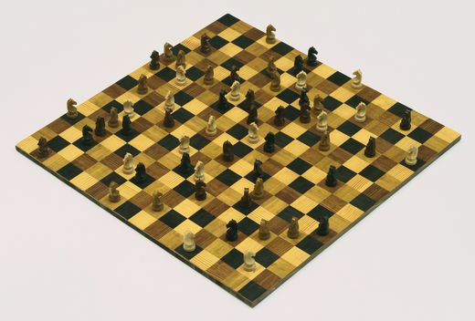
Horses Running Endlessly, 1995
Wood:    board: ¾ x 341/3 x 34½ in. (2 x 88 x 88 cm.)
64 knights each: 3½ x 1¼ x 1¼ in. (9 x 3 x 3 cm.)

Horses Running Endlessly, created in 1995, is also another example of an average, everyday game and object, turned into something that confronts the viewer’s eye in a different way. The squares are clearly geometric with hard, linear lines. This chessboard differs from the usual: it contains four colors instead of two, it is a 16X16 square board instead of the regular 8X8, and all of the players are knights which also differ in color suggesting that there are three players with three different colors. The way that the knights are positioned defies the ideas and hard set rules of the game. They can ‘run endlessly’ because they cannot be ‘checked’ by any other player and are free to go wherever they wish. In this sense, Orozco’s content becomes a sense of a disillusionment of time and rules within that time.


My Hands Are My Heart, 1991
Terracotta, approximately 6 x 4 x 6 inches


 My Hands Are My Heart was done in 1991 out of Terracotta clay. From the photograph you can see Orozco created it with hands. However, it was clearly not done without a great amount of intention and thought. The ‘terracotta’ color is earthy, and the shape the fingers have created is completely organic. There is a sense of implied line made by the fingers, but it is very curvilinear. This is my favorite of the ones that I have shown you because of the underlying pieces I have noticed. The power of the first photograph feels like he has something hidden inside that he is protecting and savoring, and then we realize it is his heart. The imprints the fingers have made in the clay are especially intriguing; they are, in fact, in the shape of an anatomical heart. I also feel that it represents the rib cage of a human torso, the holder, the capturer, the protector of the heart. Is it his generous giving and showing of his inside emotions to his viewer? Or the continued representation of the human figure and how it relates to the world. Maybe Orozco is leaving it up to his viewer to decide, just as in all of his artworks.